Use Case: Creating simple report
In this article, we will show you how to generate report from Excel to chart-report
.
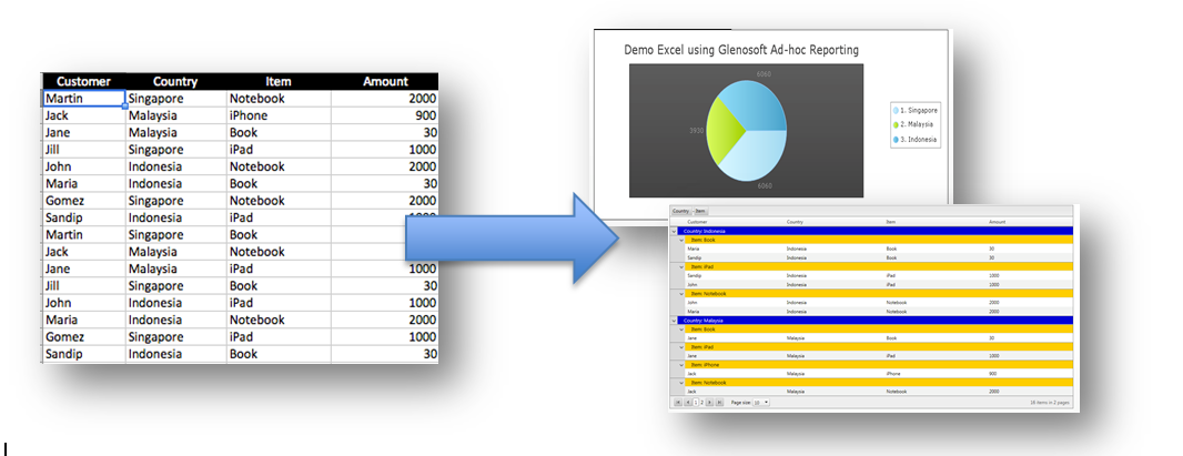
The Goal: We want to upload the Excel and display it in Pie Chart format which can be viewed on Intranet.
LetLet's start!
LetLet’s say, you have an Excel with following data: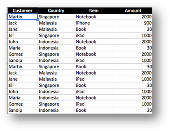
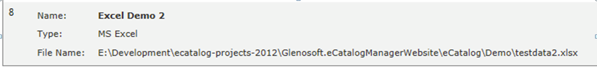
We upload the Excel into the system and create the “Data Source”.
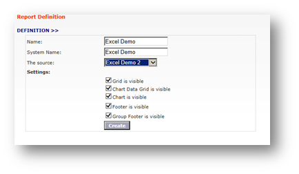
We start creating the ad-hoc report, by selecting the Data-Source we just added:
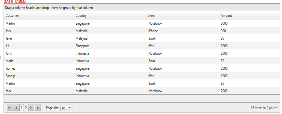
Once created, the system will retrieve the data inside the Excel and populate it into the table:
W
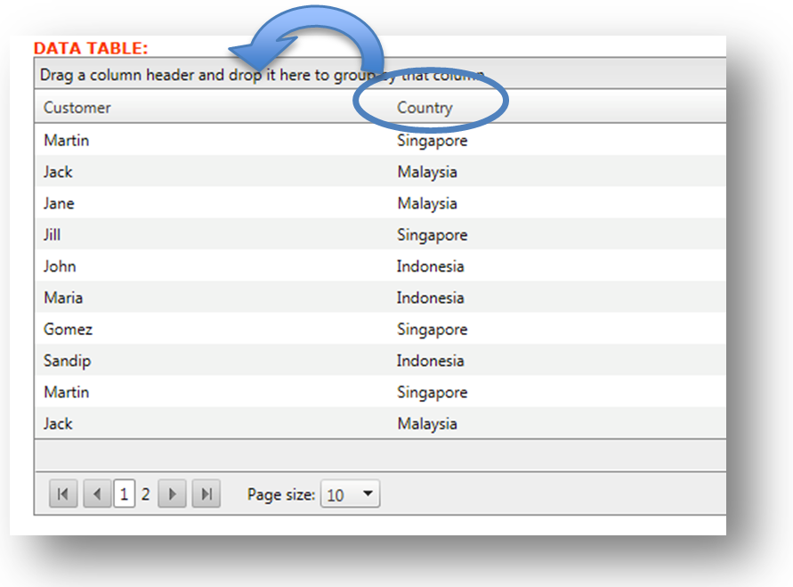
We can group some data, by drag-and-drop the field to the Group Panel.
Now the table is grouped by Country: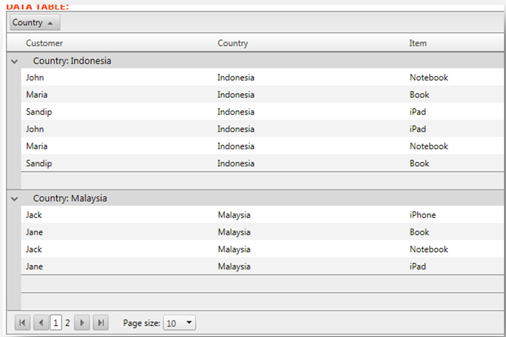
We can also do multiple grouping. Let’s say, the second group will be the Item:
To make it easier to view, we can change the background color of the groups. Let’s take a look: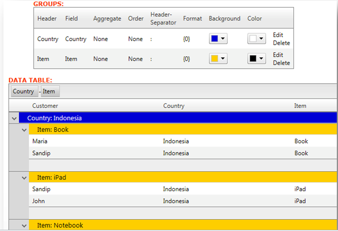
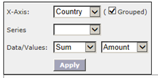
To create the chart, we need to prepare some Chart data, specially whether you want to display the sum of Amount:
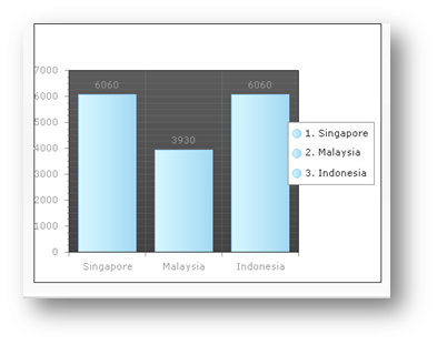
Once it’s done, the chart will show:
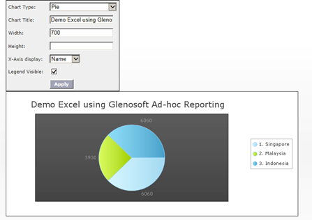
We can further configure the Chart information, such as the title and the type of chart. For example, we want it to show as Pie Chart:
That’s it. It’s a really simple process to generate the report and the chart by your-self, without getting to know technical stuff.
The report and chart can be viewed online as well for others to view. For example; we can display it on the intranet website.